
I've been working on Myth for a few months now. I'm a bit slow to update, but it's because I've been really trying to hone in on the art more. The first few episodes I was more or less sketching and trying to learn how to color on the fly. Now I feel a lot more comfortable with the tool in Clip Studio so I'm slowing down and getting things tweaked to how I enjoy them.
Putting it Together
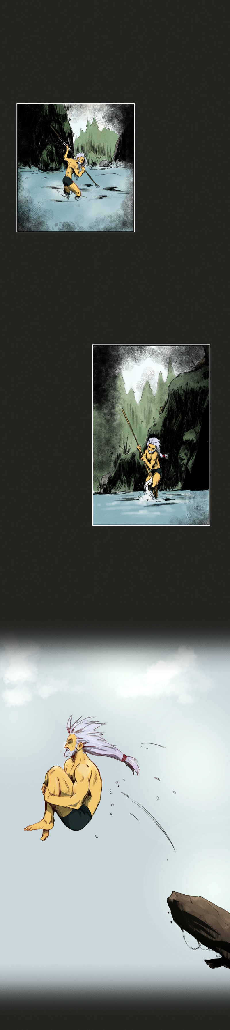
For instance, the first few episodes I was just using default brushes and tool. I've since updated and created my own brushes for drawing, inking, coloring, word balloons, panels, and who knows what else. For this illustration, which ended up being a few panels in the comic, I was working on trying to tell a story without using dialogue or words. In hindsight I could have used some sound effects or something to help set the mood a bit better. Maybe even some more panels to provide more insight to the setting the character is in and really immerse the read. Such is learning though, this is the journey of progression with sequential art. A lesson I'll take into future work.
Likes & Learnings
So a few things I really like about how this turned out. I really like the backgrounds and how they're framing the character within the panels. I also am really enjoying the texture in each panel and throughout the comic. Some things I think that could use improvement or adjustment. Some of the texture is too much or too strong, especially as a vignette in the panels. I think it comes off as messy or muddy as what's a background and what is a vignette for framing. I since I already mentioned it, I should have added sounds and more panels to give the environment a little more presence.
No comments.